
Re-Brand
Daniel Owen
A distinctive brand identity for specialist recruitment agency Daniel Owen, created while working as a freelance designer for Venn Digital. The overlapping D and O symbol represents the connection between people and businesses, supported by a confident colour palette, clear typography and flexible “We Do” messaging.

Project
Connecting people and businesses through brand design
Daniel Owen is a specialist recruitment agency serving the built environment, including construction, property services, engineering and rail. Working as a freelance designer for Venn Digital, I developed a brand identity centred on the agency’s role in bringing people and businesses together.
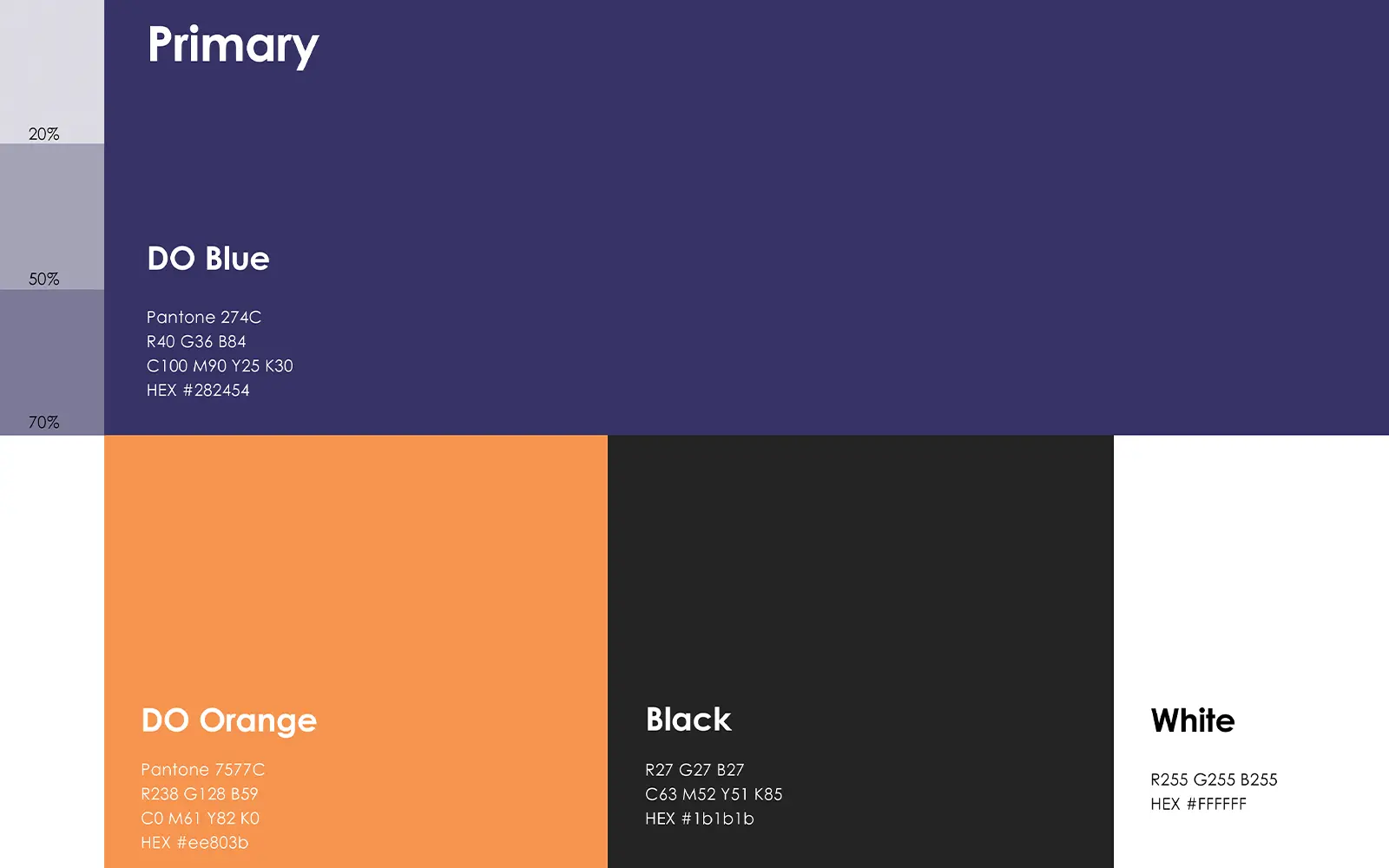
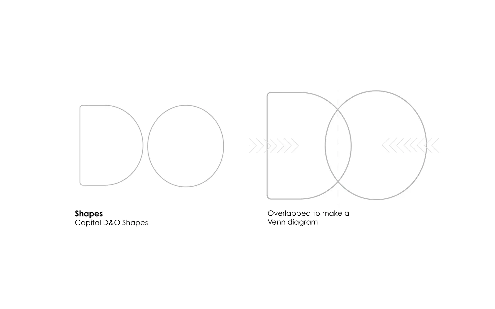
The logo combines the initials D and O in an overlapping mark inspired by a Venn diagram. The shared space represents the connection between candidates and employers, placing Daniel Owen at the heart of that relationship. A deep navy and warm orange palette gives the identity a distinctive presence, supported by clear, approachable typography.
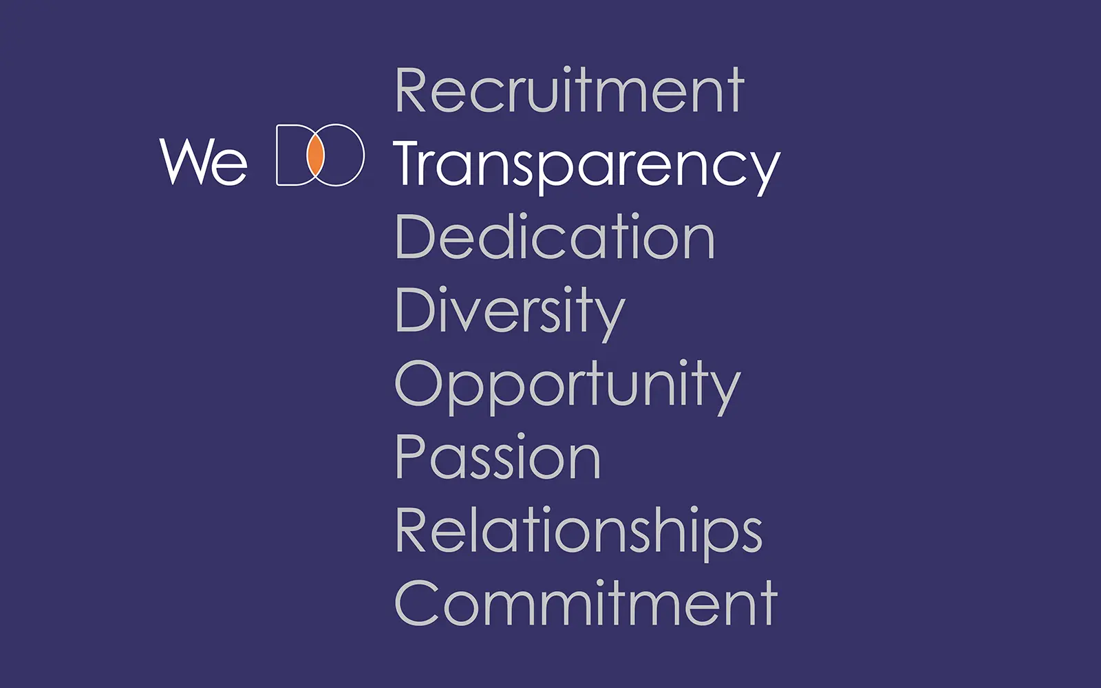
The concept extends into a flexible “We Do” messaging system, pairing the brand mark with words such as Recruitment, Opportunity and Dedication. This creates a consistent way to communicate the company’s services and values across different applications.
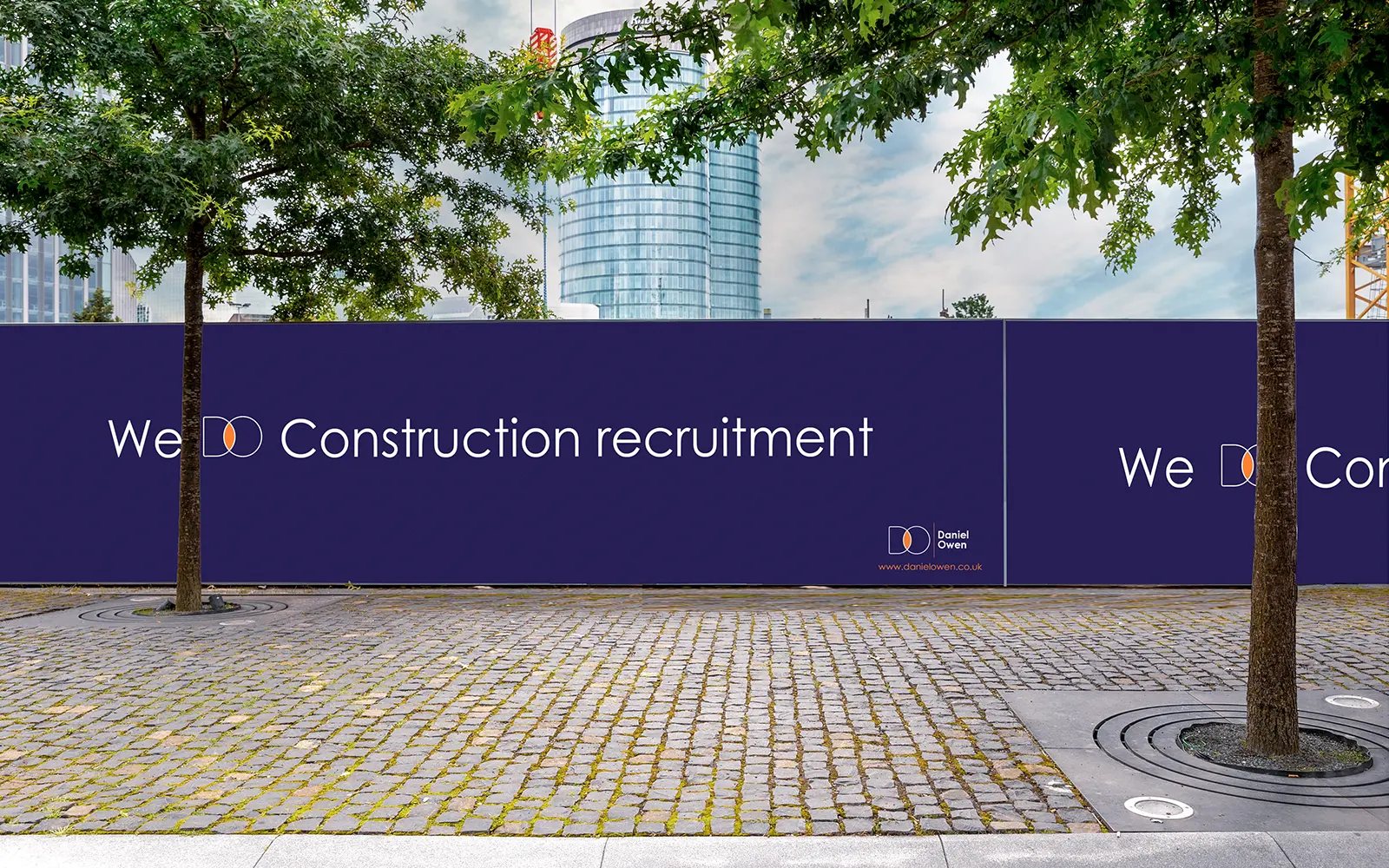
I brought the identity together in a set of brand guidelines covering logo variations, clear space, colour, typography, social media and imagery. Examples for LinkedIn and construction hoardings demonstrate how the visual identity can work consistently across digital and physical settings.
Completed
2023
Scope
Branding
Visuals
The Challenge
The challenge was to express Daniel Owen’s role in connecting people and businesses through a distinctive, adaptable brand identity. The design needed to reflect its values of trust, resilience and dedication while speaking to both candidates and employers across the built environment. It also needed a consistent visual language that could work across recruitment messaging, social media and printed materials.
Shadespan
The Solution
Working as a freelance designer for Venn Digital, I created an identity built around overlapping D and O shapes, representing the connection between candidates and employers. A navy and orange palette, clear typography and flexible “We Do” messaging supported the central concept. Brand guidelines brought these elements together, with logo variations, imagery treatments and examples showing how the identity could be applied across LinkedIn and construction hoardings.
Project details
Services Delivered
Logo & Visual Identity
Distinctive logo, colour palette and typography
Brand Guidelines
Clear guidance for consistent use across print and digital
Brand Creation
New logo and visual language